
Echi
[Photo Forum Moderator]
6560

Love the backside a lot...
I prefer the black dial but the white dial seems to handle better the "proliferation" of markings on the dial.
the white on black dial markings can be distracting with the words "chronographe", "riuessec", "anniversary edition", and "swiss made" shouting themselves much to the chagrin of the dial hands which just disappear because there's no contrast... i would have preferred the hands to be blued.
also, i would've taken out the "montblanc" marking as well. most of the markings can be put at the back.
then there are those 2 blued screws at the top which distracts me as well. i think that can be taken out to give the time a more half circle look.
how to handle the markings as i guess we do need to put a couple on the dial.
well, i'd only put there "montblanc"and "swiss made". the swiss made can be made to stay where it's at but maybe not written in white. something a bit more subdued.
no idea where to put the montblanc. maybe we don't have to as it is really a watch that can hold its own anyway and you have that snow thing already on the crown.
a great watch overall.
A peek of the Montblanc Nicolas Rieussec Chronograph Anniversary Edition

I love this Chronograph a lot.
platinum...
Thanx

Great photo! The new, simplified chronograph disks
Kong, just curious if the WG/Black dial had luminous material?
Need to verify ...
Only 125 in Pink Gold???
Here are the run numbers...
Anniversary Pink Gold 190 pieces ...
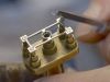
interesting detail on case back
I prefer the black dial version.
Should be ...

Will be great if ever ...
Yes but I think MB is trying very hard to be exclusive and